Our Research Goal
Before writing any code, we looked at how top e-commerce sites actually work. We didn't want to just copy them; we wanted to understand why they put buttons in certain places or why they chose specific colors. By looking at local sites like Daraz and global giants like Apple and Microsoft, we figured out how to make EcoMart Nepal simple, clean, and easy for anyone to use.
| Site We Studied |
What We Looked At |
How We Used It |
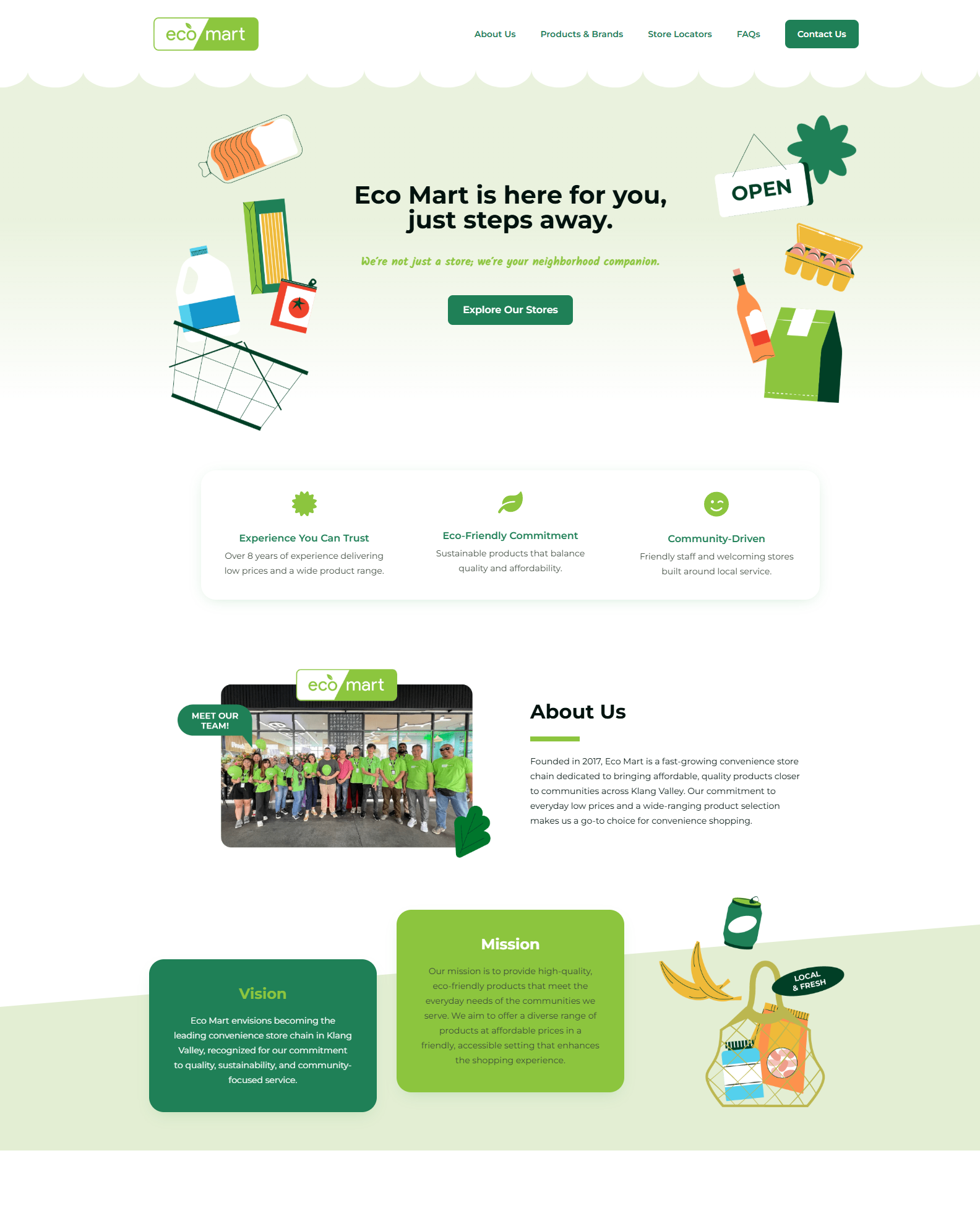
EcoMart Malaysia
(ecomart.com.my) |
Brand Identity & Colors |
We liked their use of green to show they are eco-friendly. We kept that same feeling but made our navigation bar much simpler so users don't get lost in too many menus, and we used less colors for that minimalist design. |
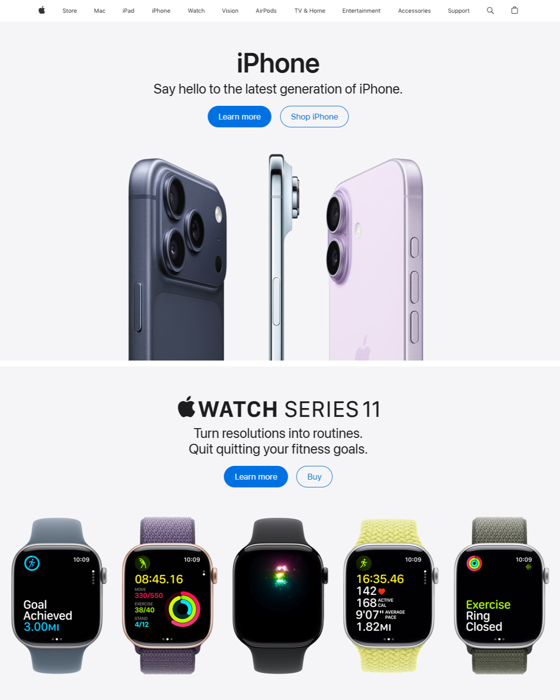
Apple
(apple.com) |
Landing Page & Buttons |
Apple is the pinaccle of clean design. We used their style of big images and "Call to Action" buttons (like "Shop Now") so the user always feels that temptation to click it. |
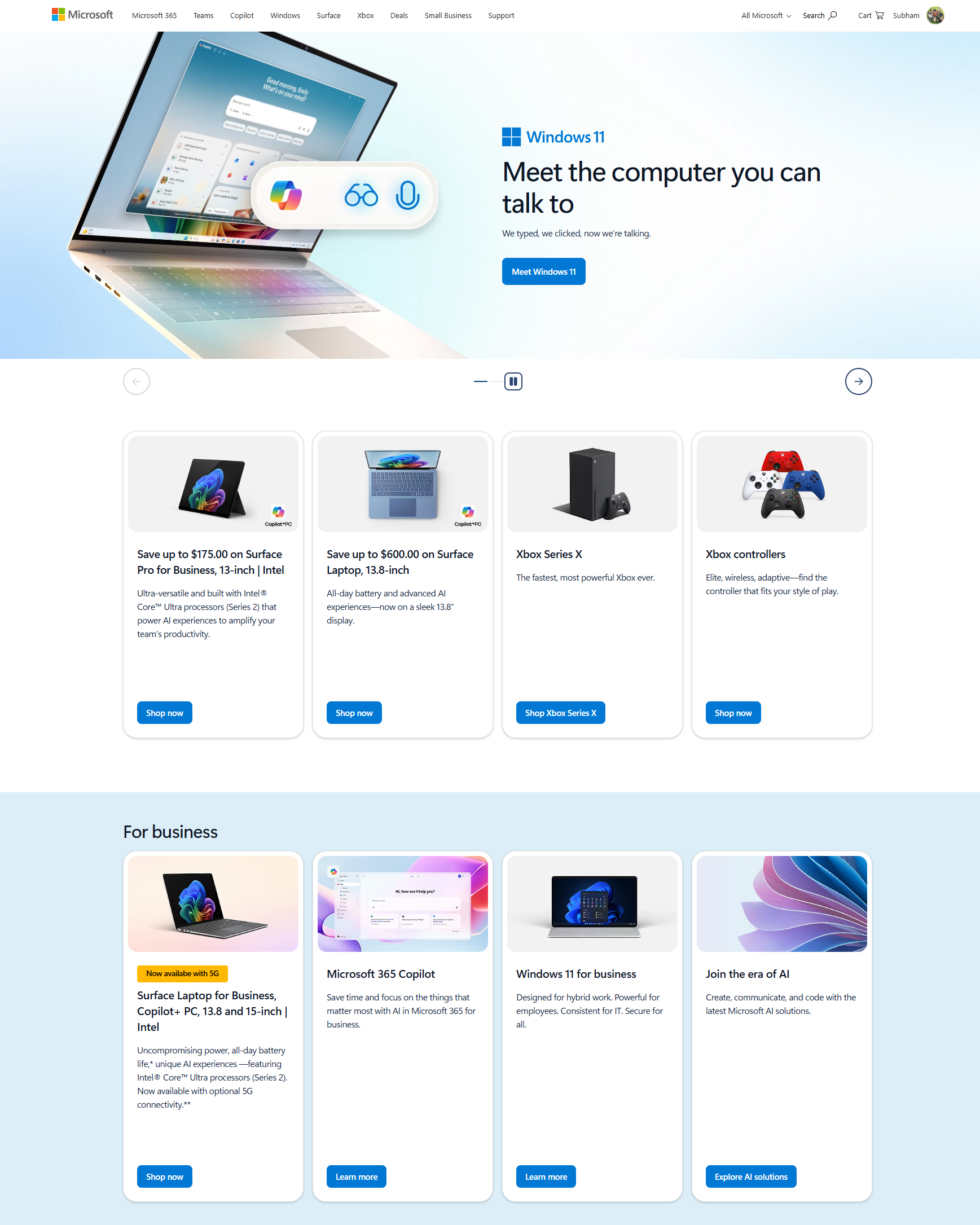
Microsoft / Amazon
(microsoft.com) |
Product Card Layout |
We studied how these sites show products in a grid. We learned that the image needs to be on the top of the card, large and clear, with the price and name kept small but clear underneath to avoid cluttering the screen. |
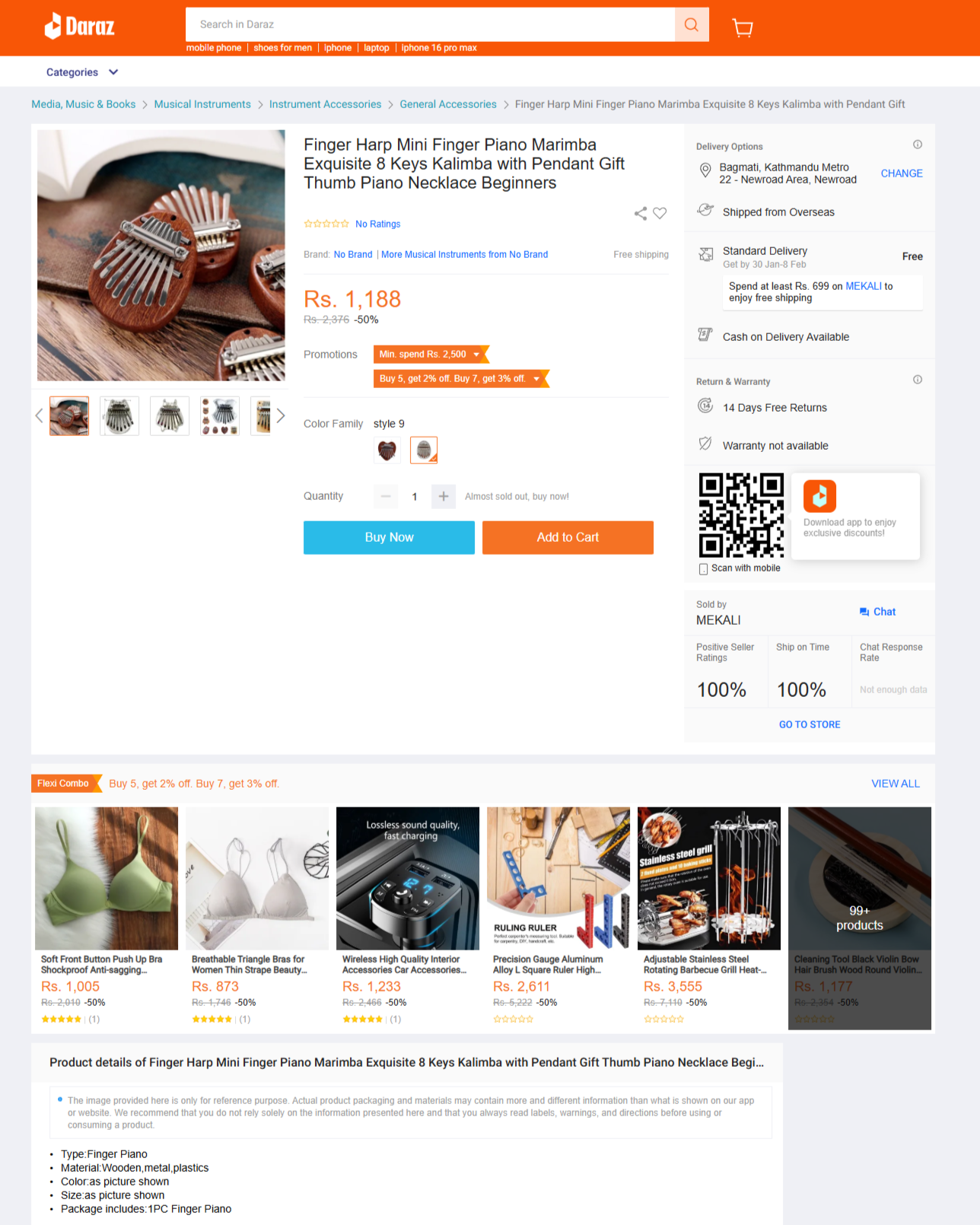
Daraz Nepal
(daraz.com.np) |
Product Details Page |
Since Daraz is popular in Nepal, we looked at their product info layout. However, we chose to remove all the annoying ads and pop-ups that Daraz uses to give our users a more peaceful shopping experience. |
A Side-by-Side Look
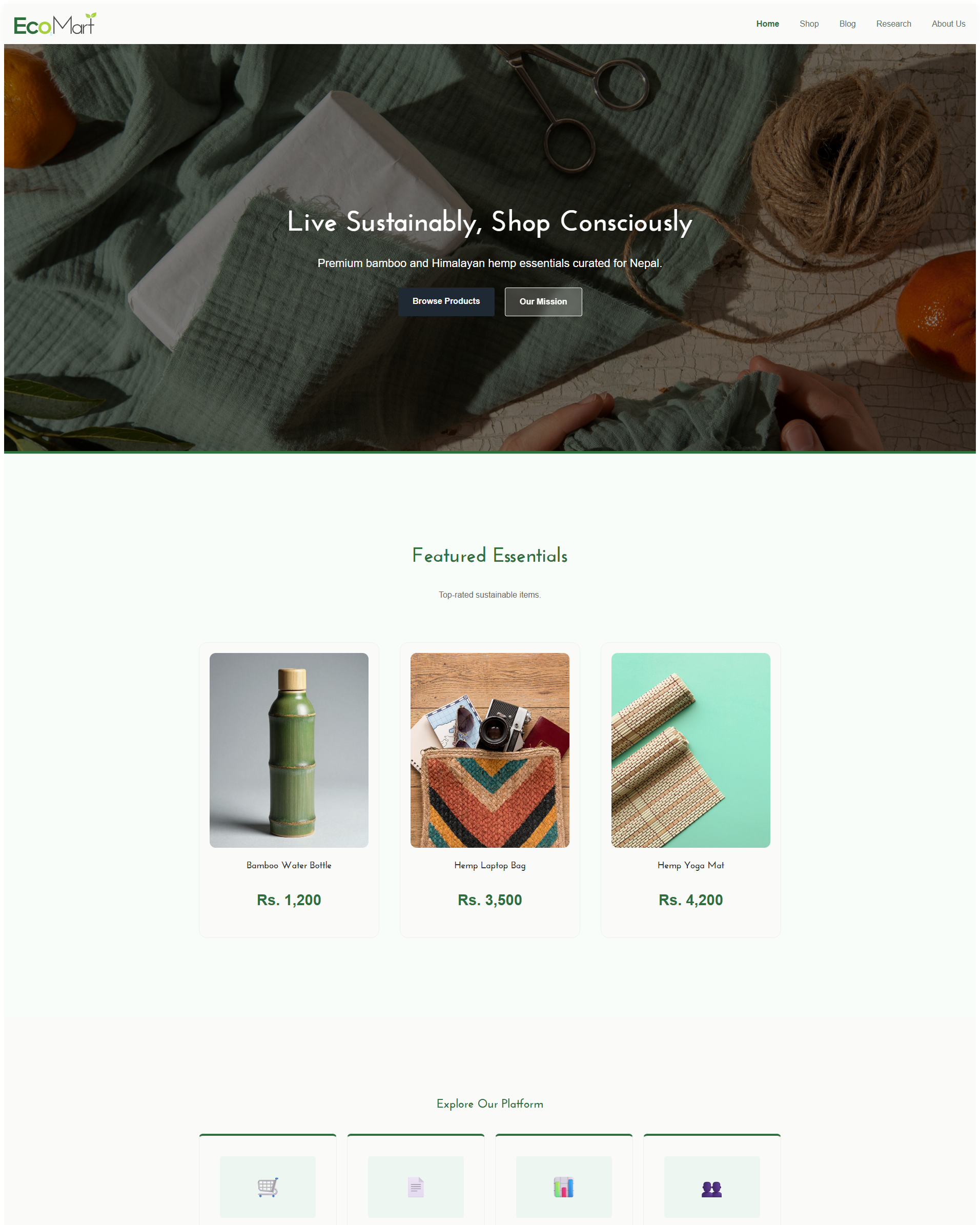
The best way to see our progress is to look at our site next to the ones that inspired us. On the left is the original reference, and on the right is how we built it for EcoMart Nepal.
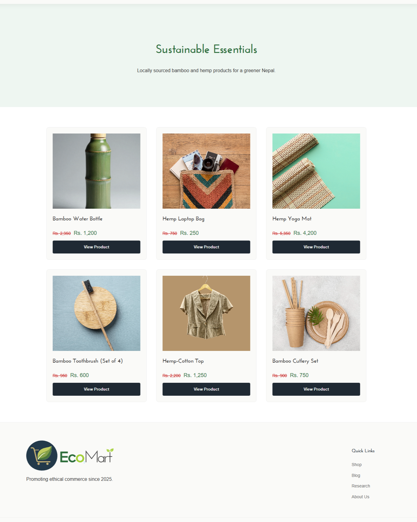
Heavy inspiration from EcoMart Malaysia
The Malaysian version of EcoMart has a great reputation for sustainability. We used their green-and-white theme because it tells the user immediately that we care about the environment. Our version improves on this by using more "white space," which makes the text easier to read wile making things minimalist at the same time. Similarly, our logo and Color palette are also inspired by their website.
Landing page, CTA & Apple
Apple's website doesn't try to show you everything at once. They focus on one big product. We did the same for our homepage. Instead of a messy list of items, we used a large section that welcomes the user and points them directly toward the Shop page using a high-contrast cta buttons. Similarly, we also took notes from their landing page and added a small overview of our products just below the Landing section. In short, we took Apple's clean design approach & User Experience and implemented it in our Landing Page.
Product Page & Microsoft.com
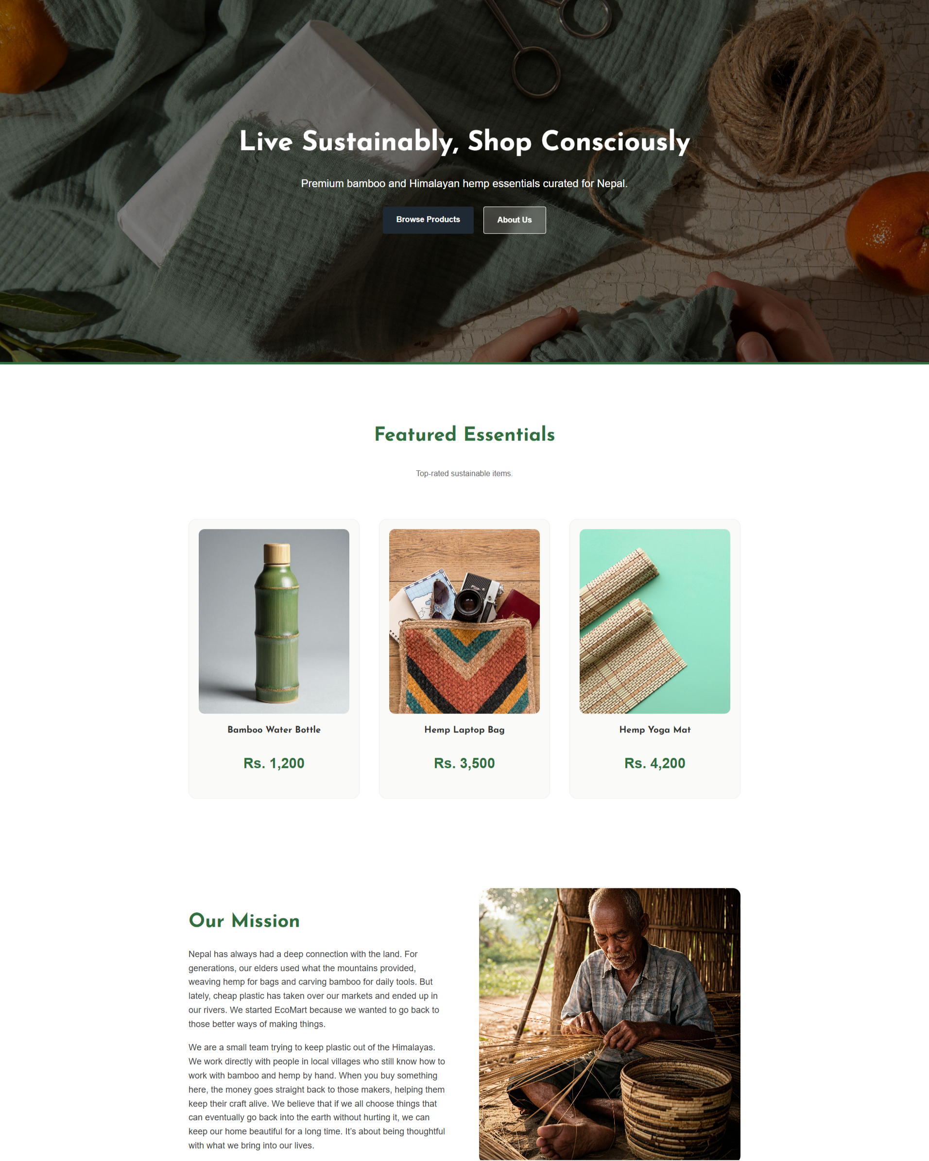
When you are looking through hundreds of items, you don't want to be overwhelmed by cramped visuals and text. We took the "Product Card" idea from Microsoft.com. Each card is a neat little box with rounded corners. Taking notes from their design, we added an image, Product name, price and a "View Details" button. We made sure that the "View Details" action is the most obvious part of the card, which gives a good User Experience and strips away all the clutter.
Indivisual Product Pages & Daraz Online
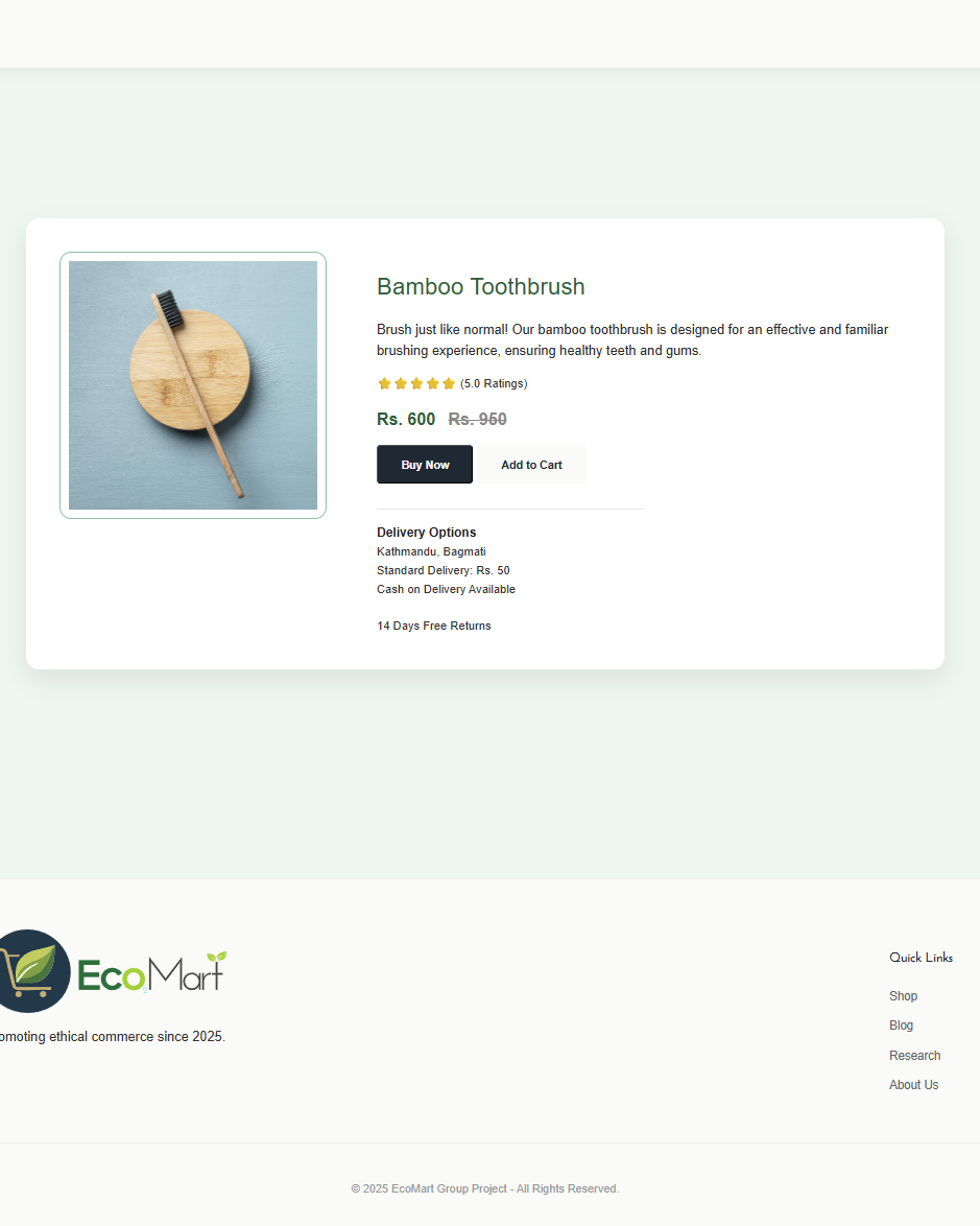
Daraz is the biggest online store in Nepal, but their pages often feel very crowded and messy. They use many flashy banners and "buy now" countdown timers that can make shopping feel stressful for regular people. For EcoMart, we decided to take a different path by keeping only the parts that actually matter, such as the large, clear product images and easy-to-read pricing. We removed all the extra clutter and distractions to create a page that looks much more professional and clean. By focusing on just the important stuff, we made the site load a lot faster, which makes the whole experience feel much smoother and more relaxed for the user.
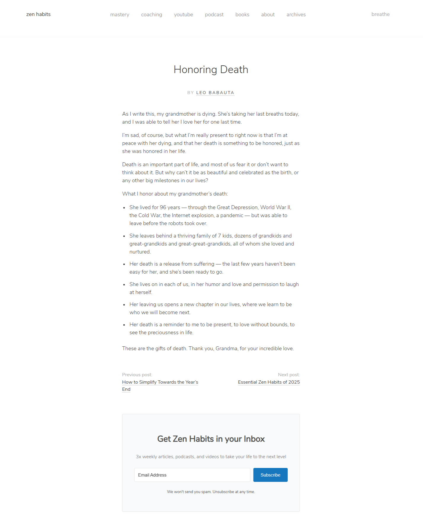
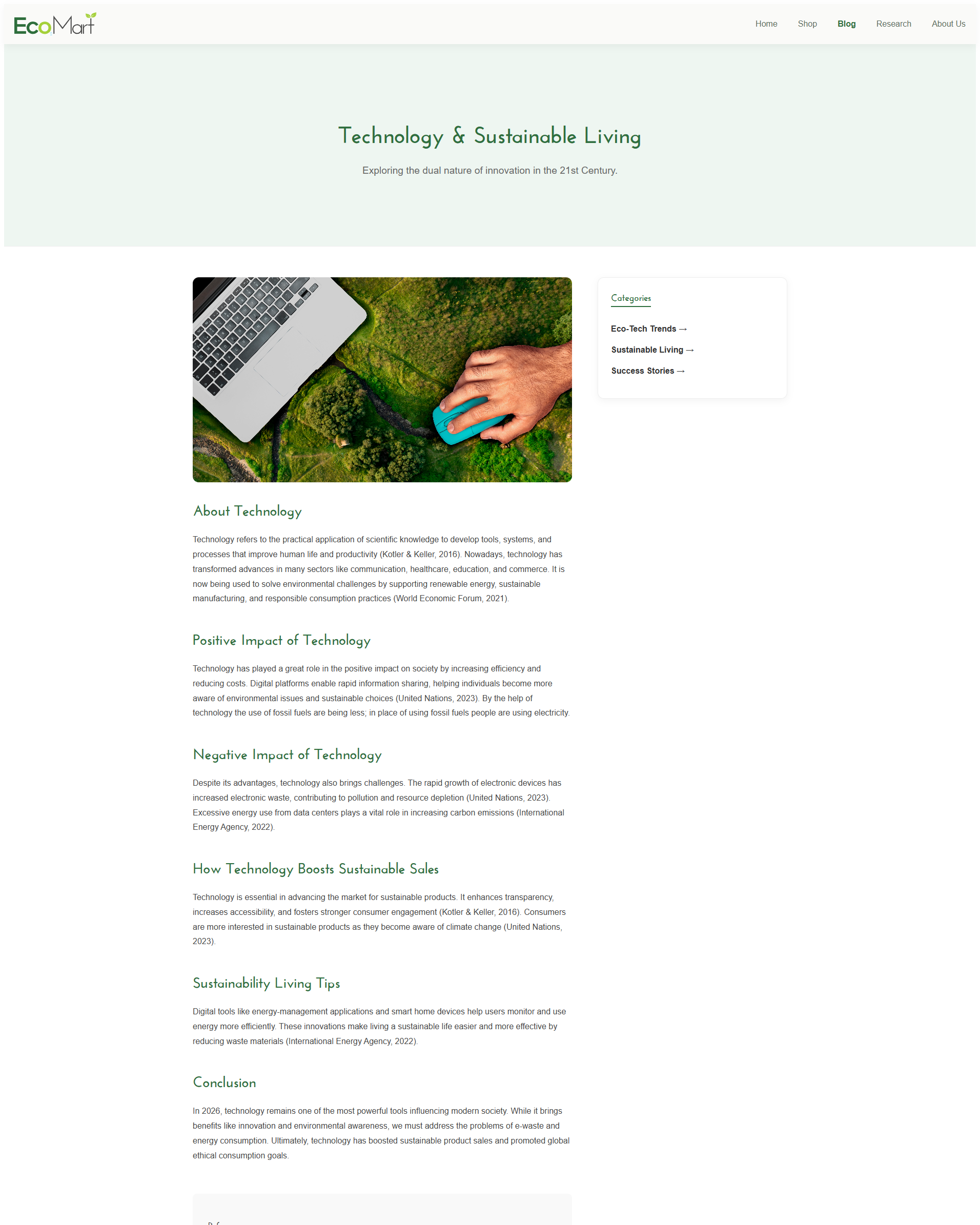
Blog Pages from Zen Habits
We chose Zen Habits as our main reference for the EcoMart blog because it uses a single-column layout that focuses entirely on the text, which is a design choice we wanted to follow. Most websites use sidebars and flashy headers that distract the reader, but this minimalist style helps us keep the page clean and easy to navigate. By using lots of whitespace and simple typography, we make sure the layout doesn't feel cramped or overwhelming for the user.